

If you’re looking for an intellectual image translator, you’re in the right place. Making the essence of a product visual, that’s what I love. This creates an packaging design that sparks the imagination.
LIESBETH
RONDEN
EXPERIENCE MATTERS,
INTUITION MAKES
THE DIFFERENCE
I believe in open collaboration with you as a client as well as open innovation within my network. That network consists of a fixed number of strategic partners, including a product developer, a process manager, a retail specialist, concept copywriter and all-round technical/creative DTP specialist Joost Verbruggen. All are independent and have been with Studio Liesbeth Ronden for many years.
Depending on your question, I create a compact team. We work very analytically. Investigate the market, explore the scope for a unique packaging design and brand identity.
Then, I’ll take you through the creative process. Together, we truly dive into experimentation and explore all possibilities. From the very first designs, we examine how a product stands out in the supermarket, how it speaks on the shelf, and how it resonates from the kitchen table.
This is how I combine packaging design expertise with over 20 years of experience. Yet, I dare say that, in the end, it all comes down to intuition. The ability to judge whether something is right, whether it works in practice. That feeling that it just fits.

"PROUD WINNING THE RUNNER-UP NL PACKAGING AWARD."
The visual identity is a play of various meaningful, graphic elements: a visual language of where we were, where we are, and where we are headed.
Curious to read the full interview from VerpakkingsManagement, 3 Questions to...?Find out more here!
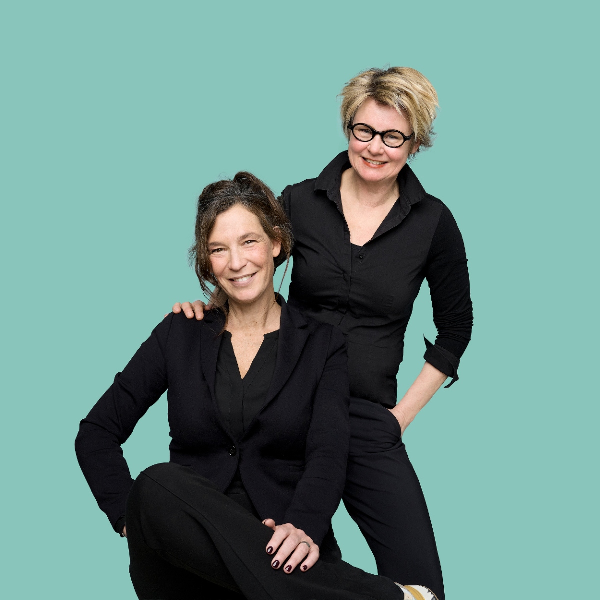
Under the label ‘Food forward’ I work in co-creation with Yolanda van der Jagt of YoVeggieWorld on plant-based total concepts. Yolanda from her expertise in product concept & taste direction, I from packaging concept & art design. Together, we contribute to the next generation of healthy food solutions. Feel free to inquire about the possibilities if you want to learn more about how to promote plant-based eating in a fun and delicious way.
As a packaging designer, you are a kind of spider in the web, where a lot of expertise is brought together. Constantly working on the thoughtful integration of visual elements, colors, copy and typography to reinforce the brand identity. This may also involve sustainable materials or a different type of packaging. Even the flavor and recipe development of the food product is on my list of creative depths. The goal remains to design an attractive, functional packaging and product. Which appeals to the consumer, communicates the core values of the product and at the same time nourishes and has good taste.
Let’s make impact together
Get in touch , and we’ll meet soon..
